Shutterstock Editor: Redesigning an Image Editor for Non-Designers
In 2020 I was tasked with redesigning and simplifying Shutterstock Editor. The result is a site that enables non-designers to easily create, publish, and amplify their stories using Shutterstock content. After launch downloads increased 30% YoY.

Role
UX Designer
Company
Shutterstock
Categories
Mobile, Web app, B2B, B2C
Timeline
2020
Overview
Goals
Simplify and streamline the capabilities of Shutterstock Editor
Increase image downloads from Shutterstock Editor YoY
Enable sales teams to sign more lucrative deals with enterprise partners by including Editor capabilities
Core Team
Product manager, 1 engineering team, analytics and me.
Process Overview
Deep dived into current Editor customer base. Revisited personas based on research.
Looking into data, understood the most/least used features to first define prototypes for initial testing
UX changes based on data. “Jobs to be done” approach
Revisited information architecture to simplify and streamline
Conducted user testing with different designs and sought feedback from other designers (iterative)
Created guidelines that allows Editor to be customized for any brand
Release and continue to iterate
Problem
User Problems
User feedback that Editor was complex and difficult to use
Lower conversion rate due to feature bloat, confusing information architecture and cluttered UI
Losing to competitors because of our outdated UI and lack of templates
Abundance of pop-ups and tooltips that distract from their flow of work
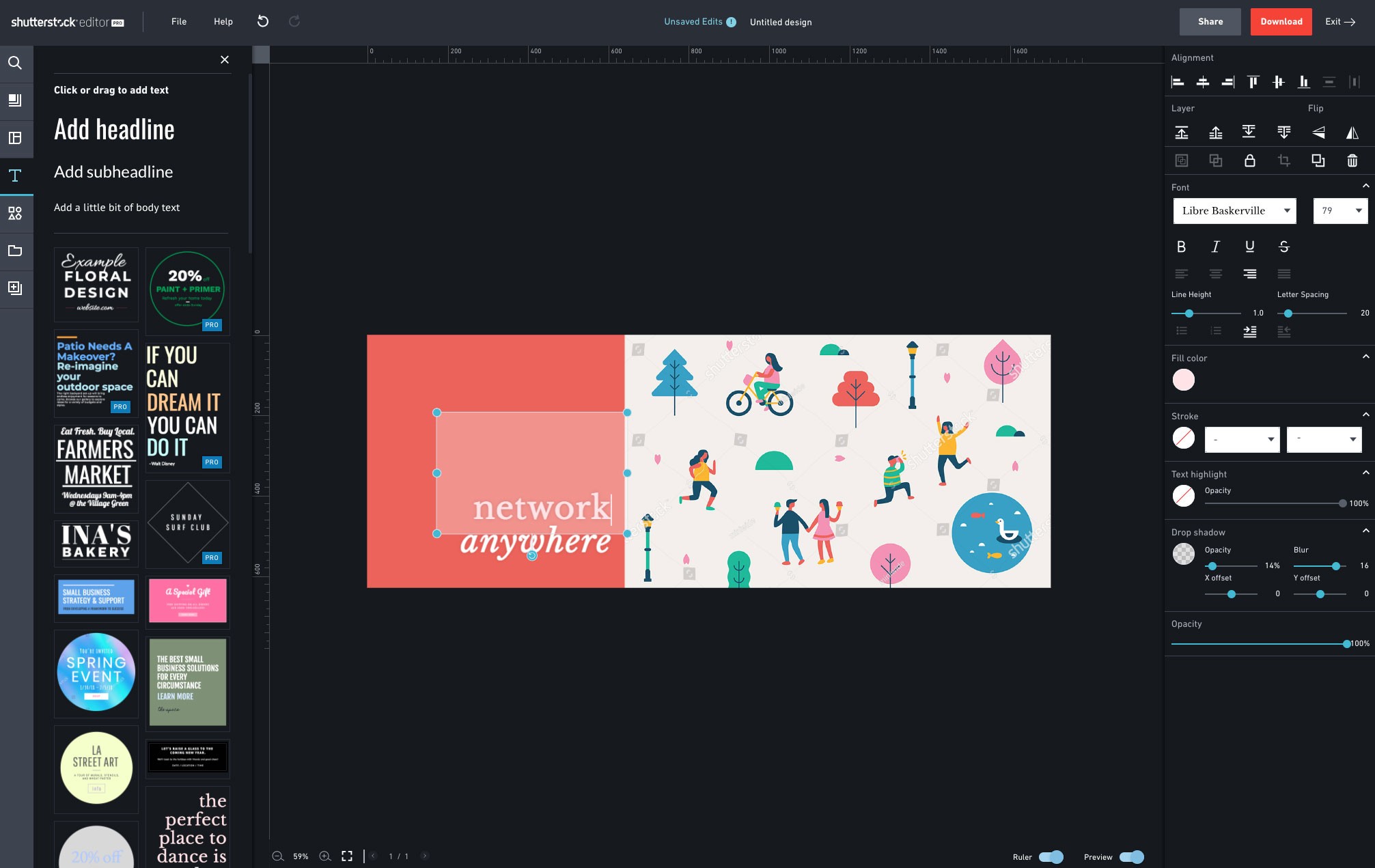
before state
Foundational Research
Persona Creation
Our target user group is small to medium business workers who are not creative professionals, but need to design and edit imagery. The u group was defined by examining market opportunities and the Shutterstock customer base.
Site Audit
The old Editor had editing actions duplicated in several spots throughout the site. This (in addition to the cluttered UI) overwhelmed users and gave the impression that Editor was a professional editing tool.
In order to reduce feature bloat, myself and the product manager did a full-site audit to ensure we could eliminate replicated features and looked at usage data to remove unpopular functionality.


Solution


Information Architecture
Information architecture remained a problem for the previous version of Editor. Editing tools were interspersed with features to add items to the canvas. While some editing tools were shown as disabled when they couldn’t be used, others disappeared from the panels creating an inconsistent experience.
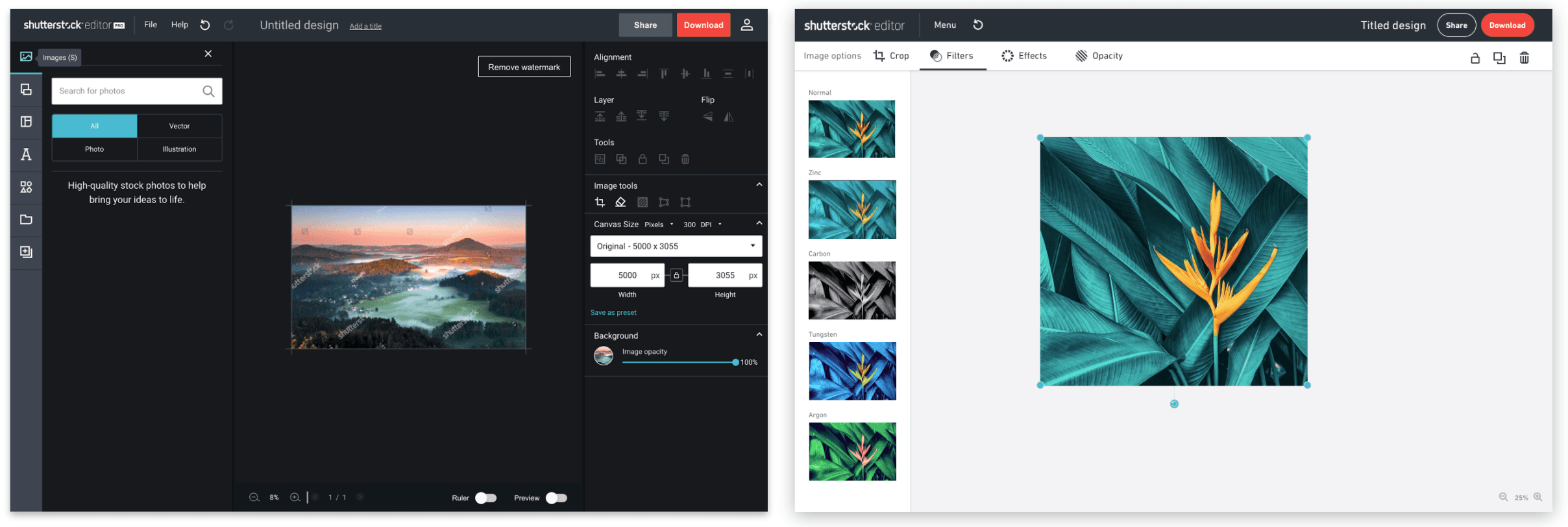
In order to remedy this, I reorganized the IA to feature only editing panels on the top toolbar, and items users could add to the canvas on the left side of the screen.
By looking at click data, previous research and competitor analysis we defined the top 4 jobs to be done. As the target customers are prosumers it was important to focus on making these 4 tasks as easy as possible.

UI Design & Customization Work
In redesigning the UI I had 2 goals. One was to make the tool appear friendly and simple to reduce the number of users who might be intimidated upon seeing the tool. My second goal was to create a UI that works in light mode, dark mode, and could be completely customized by our API partners. Customization options, in addition to the sleek new look, helped our sales team to secure big ticket deals with other companies.
User Testing
Throughout the design process I ran usability testing to verify design decisions. This process helped us to confirm that our left side menus did not need static labels, and gave the team insight as to what patterns users did or did not understand. Over the course of the project my product manager and I ran 6 usability tests on a majority of the features.
Additionally, after launch we prompted users to give feedback about their experience. This has helped us to keep track of pain points and what we did well.
impact
Business Impact
Downloads increased 30% YoY
Our sales team was able to secure two new enterprise deals with our Editor product and upsell one client to upgrade to the new Editor.
This redesign has enabled the Shutterstock to place Editor in a more prominent place in the experience going forward. This is shown with the launch of Shutterstock’s templates landing pages and soon to be released functionality.
30%
increase in downloads YoY
2
New enterprise deals reached at launch
$1.6M
Increase in existing deals to include the new editor
1
New product offering (templates) added
reflection
What I Learned
The new Editor was launched before engineering was able to finish all the features that were meant to be included. This was done in order to meet a marketing goal for the company. If I could do this project again, I would ensure that we keep a way for existing customers to access the old Editor UI until all features were built out. As we launched without one of our most popular tools, background removal, we both angered existing customers who relied on the feature and created a headache for our customer care team.
I would also work more closely with product to ensure the most important features to the UX are built first. As we did not complete all the features we planned to before launch (for a variety of reasons), some things that I felt were necessary for launch were left out. Thankfully they were treated as fast follows.
What's Next
I created designs that would increase Editor’s features without cluttering the UI. Additionally new templates are always being added to begin to compete with other design softwares. My hope is that the company will reinvest in features for Editor post its MVP launch.