StateFarm.com
Redesign of the typography and layouts for Statefarm.com. The goal of this redesign was to turn our content heavy pages for into easily digestible and beautiful experiences for the user.
Based on my initial redesign of the banking area of the State Farm website (a relatively minor area of business), leadership asked me to begin redesigning the insurance pages (the core of the business) and create the standards for State Farm’s web presence.

Mission
Simplify the complex information on our lading pages, and turn the overwhelming task of shopping for insurance and banking products into a simple and delightful experience.

Users
We know our users are busy. They’re moms, uncles, grandfathers, college students and young professionals. They don’t have a lot of time to learn the ins and outs of our products so it’s our job to make it clear.
Before State

Densely packed information and a lack of clear content hierarchy made browsing the site difficult.
Typography
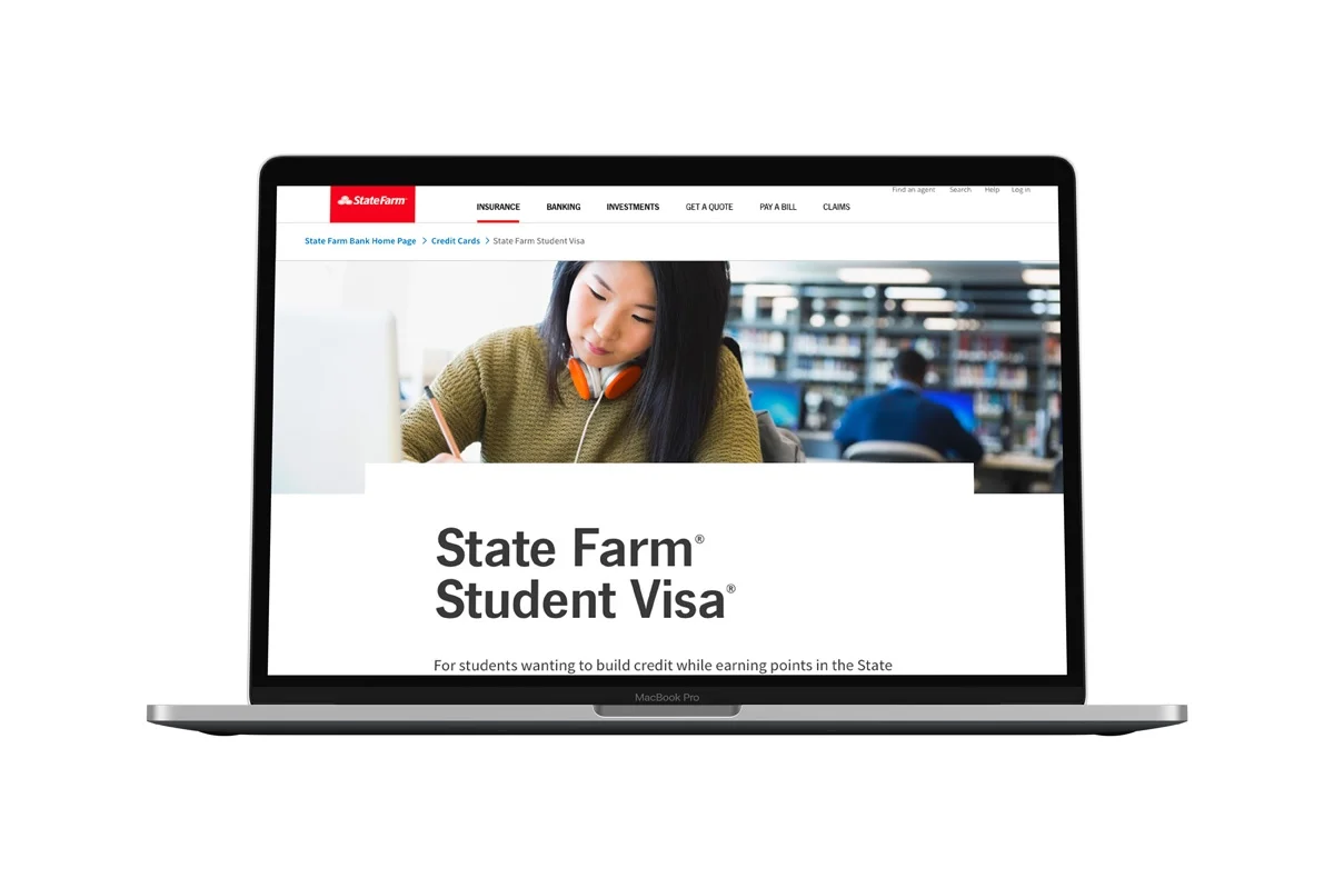
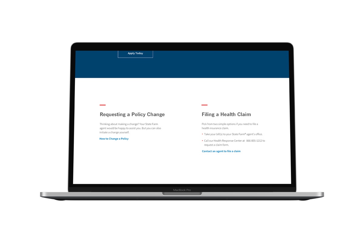
Content is king when it comes to shopping for insurance or banking products. It can be complicated and confusing. We want to make sure we give the user all the information they need to choose the policies and accounts that are best for them. Because of this, we stripped down the visual clutter to allow the user to focus on the details that matters. My creative director and I worked to define a set of typographic styles that call attention to what’s most important.

Layout
Our users are busy, and shopping for insurance and banking products is a necessary, but not so enjoyable task. Our product information can be complex so I broke up our landing pages into digestible chunks, so that the user is only visually focusing on one subject at a time. I removed many of the superfluous images, using them only where they add value.
If the user knows what they are shopping for, we made sure to have a prominent CTA at the top of each page.

Ideation for Bank Landing Page Layout
Results
In the 5 months since the launch of the banking landing pages, twice times as many customers began applications for our products. This indicates that in addition to making the information more digestible, more users decided to begin the process of signing up for State Farm products.
After the success and positive reaction to the first pages, the typographical treatments and many design elements were adopted throughout State Farm.
We continue to monitor page success of the pages and iterate based on insights from the analytics department. I look forward to seeing the progression of this work as new designs roll out for our insurance and investment pages.

Page Examples

Old vs. New
Old State Farm web pages contrasted with new ones. The new designs mark a stark change in the design direction on Statefarm.com.

Animation
I used animations to break up content heavy pages and allow users to navigate to exactly the things they were looking for. Additionally, in pages soon to be released we have included GIFs and animations to illustrate complex processes that are easier to understand visually.

Sitewide Consistency
The new design patterns were shared across the design organization. The design team worked to ensure all landing pages and web based applications eventually adopted this look and feel.