
State Farm Navigation
In November 2018 my creative director, director of architecture, a UX Architect and myself were asked audit and re-imagine StateFarm.com’s navigation design and architecture. In June 2019 the redesign was released.

Evaluation
During our Heuristic evaluation of the current site we noticed several design and architecture decisions that were detrimental to the user experience.


Pain Points
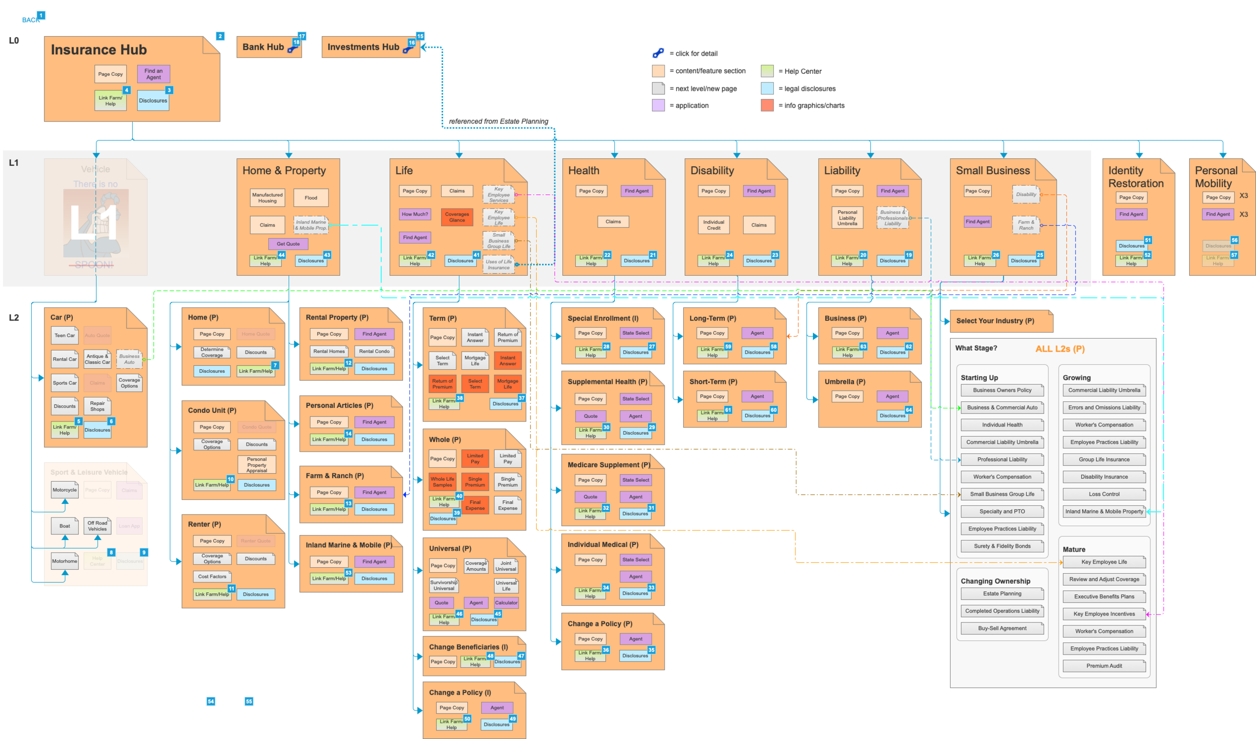
The taxonomy of the site was not clear. Menus displayed both “Banking” and “Banking & Investments” as product categories.
Main navigation links included two links that directed the user to the same page as well as a hamburger menu that again repeated links.
The visual design was heavy and not consistent with the new design system that had been released in October.
The main navigation did not take user directly to product-level pages despite research that indicated our users knew what products they were looking for when landing on the home page.
The primary actions that users looked for on StateFarm.com (Find an Agent, Get a Quote, Pay a Bill) were buried in the navigation’s sub-menus. This meant most pages had to include “quick action modules” to allow the user to do these things.
Goals
Based on our Heuristic analysis we created 3 main goals
Highlight the users’ primary actions so they are available on every page.
Display the types and categories of products we offer in a way that makes sense to the user.
Create visual consistency with the site’s new design system
Goal #1 Highlight Primary Actions
Throughout our architecture work we brought our priority actions to the top level of the navigation. With one click users could begin the process of getting a quote, filing a claim, paying a bill, and finding an agent. We also designed the menu so it would display when the user began scrolling up. We did this to ensure users could easily locate the main actions even when scrolled further down on a page


Goal #2 Improve Taxonomy
In order to address our second design goal we worked with our UX research partners. We wanted to divide our financial products into two clearly delineated sections- “banking” and “Investments”. In order to better understand how users percieved our financial products we conducted a card sorting session with 5 participants. There was almost unanimous agreement on which products belonged in which categories. The one surprise for our UX team was that users overwhelmingly identified Educational Savings Account as a Banking, rather than an Investment product.


Goal #3 Visual Consistency

In order to complete our third goal I began with design research. I looked at sites that were consistent with our current clean and typography driven look including Nike, Bose, and Spotify.
I tried several different layouts and paired them with our new landing page designs. My creative director and I wanted enough visual diversity so that the user would notice the menu items, but keep it consistent with the clean and minimalist design of our new pages.
Ultimately we landed with a clean design- primarily white with red accents to hi light our brand and action items.
Lastly I explored micro animations that would help users understand the structure of the navigation. Since we decided to allow users to begin process inside the navigation, it was important to create cohesion between the navigation and desired actions. These animations were created in Principle.

Animation for the desktop experience
Results
As a result of the navigation redesign we have had more users navigate directly to the product pages instead of having to stop on an intermediary page.
Our main actions- Get a quote, pay a bill, file a claim, and find an agent doubled in popularity after launch.

Final Designs


